Memo From Frank
The holiday season is here, and there’s nothing like the splendor of millions of Christmas lights, the nostalgia of holiday foods (and calories) and reconnecting with friends and family to discuss the year that’s passed. I’d like to take this opportunity to thank my extended “billboard family” – you are the biggest Christmas gift I could ask for. Hopefully, 2015 will be a year in which you can get some more billboards built. So have a glass of eggnog on me and HAVE A MERRY CHRISTMAS!
Why Burma Shave Revolutionized Billboard Advertising
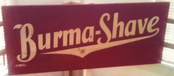
The Burma-Shave sign series first appeared in Minneapolis, Minnesota in 1925, and remained a major advertising component until 1963 in most of the contiguous United States. The exceptions were New Mexico, Arizona, and Nevada (deemed to have insufficient road traffic), and Massachusetts (eliminated due to that state's high land rentals and roadside foliage). Typically, six consecutive small signs would be posted along the edge of highways, spaced for sequential reading by passing motorists. The last sign was almost always the name of the product. These signs were groundbreaking in their effectiveness, and were soon copied by many other advertisers
Color selection
Burma Shave signs were a standard white lettering on a red background. This was derived through testing, and there was a second color contender in the early years: orange and black. However, orange and black were proven to not be as legible and were dropped. White copy on a red background went on to be the #1 color sign combination in history. Red and white are the colors for Wendy’s, Arby’s, McDonalds, Texaco and hundreds of other billboard advertisers.
Memorable phrases
The typical Burma Shave sign featured a few effective phrases. This became a hallmark of billboard advertising – use a few words that are easy to remember and that garner attention. Look at the billboards you see today from the top advertisers and you’ll see these same type of phrases, from McDonald’s current “Hail To The Beef” to Burger King’s “Have It Your Way”. Burma Shave was around 90 years ahead of their time.
High saturation
Burma Shave was the first to use a marketing technique called “bunching”, in which you have several signs in succession. This process creates greater memorability because the consumer’s brain thinks to itself “didn’t I just see that ad a second ago”. Today, many advertisers utilize the concept of “bunching”. The other day I drove by some signs for Mizzou on I-70 near Columbia that were six billboards in a row – identical to the standards that Burma Shave developed.
Simplicity
The Burma Shave creative was extremely simplistic. Basic, easy to read typestyles and no background design. Just white words on a solid red background. Since the key to billboard effectiveness is legibility while driving down the highway, Burma Shave was an early pioneer that did not use the highly affected typestyles and designs of the Art Deco era.
Driving entertainment
Smart advertisers know that they have a captive audience on the highway, and that this audience is bored and looking for something interesting. By giving them funny quotes, they could then repeat this to each other and their friends and family. This type of grassroots discussion is similar to the power of today’s social media.
Conclusion
Burma Shave was an important pioneer in billboard design and usage. Their signs look as fresh today as they did in 1925. While the modern highway is no longer two lane, and the sign laws preclude little signs on fence posts and even trees, there is much to be learned from Burma Shave’s creative endeavors. They truly were one of the outstanding leaders of the billboard revolution.
How To Make A Wooden Sign Look More Attractive
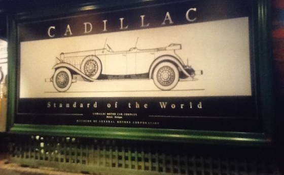
This billboard is featured in the Peterson Automotive Museum in Los Angeles, California. It is representative of the standard highway billboard of the 1920’s and 1930’s. And, in many ways, it is actually superior to the signs of today. There have never been more attractive billboard structures built that those of the Art Deco era.
No poles above the sign
Art Deco billboards had very clean lines and attention to detail. Nothing looks worse on a wooden billboard than when the poles stick up above the ad or – even worse – when they are all different lengths sticking up. It is not that hard to cut off the tops of the poles once the sign is built, and the difference in appearance is huge. Anything but a clean line hurts your aesthetic sensibility, and there’s no excuse since the cost is small.
Hide the poles altogether
The Art Deco era in billboards featured many creative ways to make the billboards seemingly float in air – without the disrupting ugliness of poles and supports. To accomplish this, it was standard fare to hide the poles behind elaborate landscaping or lattice work. Another concept – which is even more impressive looking – was the construction of false-front pillars with decorate frescoes that make the sign look like something out of a Roman palace. Regardless of how you do it, hiding the poles is not that hard or expensive, and the impact is huge.
Framing
Although the advent of vinyl, instead of hand-painting, has made the ability to “frame” the ad more difficult, it was still a significant design format for Art Deco billboards. Nothing creates a better setting than putting a “picture frame” around it. The frame can be as simple as sheet metal, although the 1920’s and 1930’s billboards had elaborate carved wood.
Painting
Art Deco billboards had their structures immaculately painted. Modern billboards are often painted too rarely, and left to fade and rust in between. The exterior condition was kept up to the same standards of a house, and the pride was clearly apparent.
Include your shield
Although steel monopoles always have a shield on their skirting, many wooden billboards are missing this important identifying market. When you don’t put your name on the billboard, it implies that you are embarrassed about it. Art Deco billboards always had their shields tastefully sized and installed.
Conclusion
Wooden billboards of the 1920’s and 1930’s were works of art. That’s why they’re in museums. But there’s no reason why modern wooden billboards cannot replicate many of the favorable features of these monuments. There’s no reason why a wooden billboard cannot look terrific, and be embraced by the landowner and the community. You don’t have to re-create the wheel. Look to the past for ideas on how to make wooden billboards look terrific at a reasonable cost.
New Billboards For Sale On OutdoorBillboard.com
Billboard Home Study Course
![]() How to Find a Billboard Location
How to Find a Billboard Location
![]() How to Buy a Billboard
How to Buy a Billboard
![]() How to Build a Billboard
How to Build a Billboard
![]() How to Operate a Billboard
How to Operate a Billboard
![]() How to Rent Ad Space on a Billboard
How to Rent Ad Space on a Billboard
![]() How to Sell a Billboard
How to Sell a Billboard
Get Your Copy Now!
The Market Report
Prices Are Delayed By At Least 15 Minutes