Memo From Frank
Election years are great for the outdoor advertising industry. A huge number of billboards are rented to promote the various Presidential, Congressional and State Government candidates. However, be careful when it comes to accepting those advertisements on your signs. I remember the first political message (and last) that I put up on a sign. As soon as the ad went up, I got a call from the property owner, demanding that I take it down. They were from a different political party and thought that the billboard suggested that they were voting for that candidate. While I was dealing with that public relations fiasco, the rent never got paid, as the candidate was having financial problems and had basically rented all the signs they could from companies that did not check out their financial strength (which was me, of course). So I ended up wrecking my relationship with the property owner in exchange for nothing. Political advertisements have one huge flaw: there is absolutely no chance of renewal. So you put in all that risk and effort and the best you get is usually a 4-month advertiser. Not worth it, in my opinion. I’d rather put a steady renewing account on a sign over a short term user with a risky spin. Nobody ever got rich off political advertising, but many people have been hurt by it. Often times, if you’re going to put up a political sign, just stick it in your yard. It’s safer that way.
How To Make A Picture Tell A Story: How Great Ads Are Made
I have a coffee table book of the greatest billboard designs of all times. When you scroll through the pages, you instantly recognize that these great sign designs all shared the same methodology. And it’s a metric can you can still use today to create extremely effective advertisements, if you know what you’re doing.
Make a list of the strongest sales points
Before you start coming up with the design, you must first assemble the following data: 1) the name of the advertiser’s business 2) the location 3) the phone number 4) the logo and 5) the three strongest sales points of their business. If, for example, the advertiser is Tom’s Hamburgers, their three strongest points might be 1) hand-cooked to order 2) best quality beef and 3) low prices.
Make your pictorial your sales pitch
The great signs have the “picture tells a thousand words” philosophy. Until the 1990’s, those designers were hampered by the fact that all “photos” had to be hand-painted on the sign, and therefore limited in what they could effectively paint. Today, with vinyl technology, you can make a print of the exact photo – the sky’s the limit. Using the example above, the correct picture for Tom’s Burgers would be a photo of the kitchen showing the chef rolling up the hamburger patties by hand and putting them on the flaming grill. That’s not an image you would see at McDonald’s and immediately tells the viewer that this is a cut above fast food. And you would want to make the photo appetizing with a bun with garnish sitting next to the flaming grill, ready for the finished burger.
Have your pictorial tell the whole story without any words first
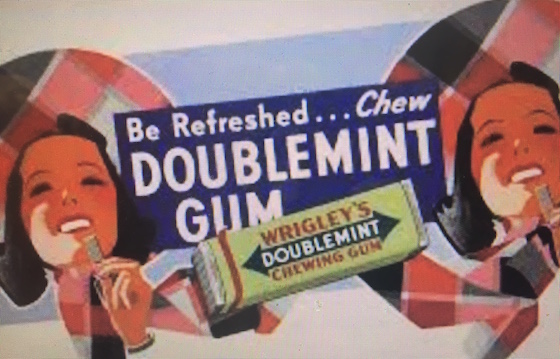
The true mark of a great sign is the ability to understand what’s being sold without even seeing the words. At a huge distance from the viewer – maybe 2,000 feet in some cases – the ad is still effective in relaying the ad message. The best example of this is the Coke advertisement campaign from the 1920’s through 1950’s. The picture is a good-looking person in a fun activity enjoying drinking a bottle of Coke. It needs no words at all to convey the message; you don’t even need the words “Coke” because you can tell who makes the drink by the shape of the logo.
Add the necessary words to complete the story – but not many of them
Here’s where many advertisers blow it. Don’t overkill the sign by dumping a ton of words on it. Every word you add takes away from the other words and reduces how much you can see of the picture. Going back to the Tom’s Burgers example, you would not want to put the words “made by hand” or “made to order” on the sign, as the photo should tell that story. The ad should be the photo from the kitchen, the logo “Tom’s Burgers”, the address in the version “Exit Now” or whatever the way to get there is, and a price explosion of $1.99. You don’t even need the phone number – this is the age of Google if you need it. The Harvard Business School book on advertising says that a good billboard should not have more than seven words. That’s pretty accurate.
Conclusion
Great billboards are like works of art. There’s a message in the work, and terrific execution. There’s no reason that every billboard cannot be “great”. Use the above steps to make your next advertisement a classic. The advertiser will reward you with lifelong renewal.
The Power Of “Combo” Ads – And How To Harness It
So you’re renting a billboard, and you’re talking to individual advertisers about the benefits of a sign. Why not enhance that search by combining certain clients together. In some cases, the most powerful sign you can create is not a single advertiser, but a combination of two or more. We call those type of ads “combo”. And there are certain advantages to this type of ad construction worth consideration.
Understanding what the power of this construction is
So what does a “combo” advertisement bring to the table? Several strong attributes. First of all, it reduces the cost for the participants. If you rent half a sign, it costs half the rent, and is much more affordable. Secondly, it can sometimes create more consumer excitement to have more than one option to choose from at an exit. Finally, it can allow some pretty creative designs, if done properly. Remember that the effective ad is the ad that renews for a lifetime.
Relaying that on to the advertisers
Sometimes you are better off pitching the advertiser on the “combo” on the front end, rather than as a back-up plan when you can’t find someone to rent the entire sign. When you approach an advertiser with a $300 per month price point as opposed to $600 per month, you’re going to definitely get a warmer reception – especially during this current Great Recession.
Choosing the right partners
From my experience, the selection of players on a combo sign is the critical part of using that structure. You have to find advertisers that complement each other, rather than conflict with each other. For example, the classic combo is two or three restaurants at a common exit. Basically three logos and the words “Exit Now”. You would not want to have a Dairy Queen and a funeral home, or a church and a topless bar. It’s essential that the combo players share a common exit. You can’t have an effective combo with two separate exit directions. You can, however, have two or more advertisers that simply share the same city such as a Buick and Dodge dealerships that simply say “Pontiac, Illinois”.
Making the ad design work effectively
The best combos have a standard directional line on the bottom, and an equal share of space (1/2, 1/3 or more) – so there’s not much room for words. You have to guard against the advertisers wanting to write a book on their portion of the ad. Maybe a logo and their top sales point is all that will fit. And be sure to make good use of colors. Each “section” should have a contrasting color – but in the same generic color family so it does not clash.
Lessons learned from my own failures
I’ve had great success with combo ads. But there are limitations. Never put a combo advertiser up that has a sketchy business model, as if they go bankrupt you will be stuck with a partially blank ad until the lease runs out, unless you can find a replacement. I have also found that there are limits to how many players you can include. I once did an advertisement for “Visit Historic Downtown Denton, Texas” and I had 50 participants – every merchant in downtown. The problem was in collections. I should have had the ad sponsored by the Chamber of Commerce and received just one check. But instead I had to collect monthly from all 50 participants. It was a total nightmare.
Conclusion
Just as Uber has made “ride sharing” successful, “combo” ads make for happy customers who pay much less per month yet still get huge results. Particularly if the economy is weak, “combo” ads may give you access to many more potential clients. It’s a win/win for everyone involved.
Billboard Home Study Course
![]() How to Find a Billboard Location
How to Find a Billboard Location
![]() How to Buy a Billboard
How to Buy a Billboard
![]() How to Build a Billboard
How to Build a Billboard
![]() How to Operate a Billboard
How to Operate a Billboard
![]() How to Rent Ad Space on a Billboard
How to Rent Ad Space on a Billboard
![]() How to Sell a Billboard
How to Sell a Billboard
Get Your Copy Now!
Is This An Opportunity?
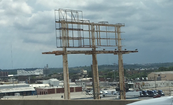
You can’t drive very far in America without seeing an abandoned billboard. Some still have the old ads on them, and others have been stripped down to the frame. These are not always eyesores. Sometimes they are opportunities. So how can you tell?
What’s the story of how the sign came to be this way?
The first stop is to find the landowner and ask them the story of the sign, from construction to abandonment. What happened? Was it the inability to reach a satisfactory land rent upon lease renewal? Was it the result of a windstorm and the sign company gave up on the location? Is the market too weak to rent the ad space? See if the story involves something that you can fix, such as finding an advertiser, removing an obstruction, or making the property owner happy.
Who technically owns the sign structure at this point?
So who owns the sign structure? In many cases, the property owner does by virtue of abandoned property laws. But you need to ask. If they say “I haven’t been paid in 10 years and they never answered my calls” then it’s a good bet that the sign is legally the property owner’s. If he says “they’ve paid me rent for the last 5 years and never put an ad up on it” then you need to try and buy it from the sign company.
Will the property owner let you bring it back to life?
It’s a simple question. The sign is not producing income. Would the property owner agree to allow you to bring it back to life? Is most cases, the answer is “yes”. Who would not want an ugly eyesore made into monthly income? It’s a win/win for both parties.
Can you bring it back to life?
Some signs are too expensive to save. They are broken or damaged from storms or the deterioration of the elements. Without engineering, it’s hard if not impossible to make improvements. But if the sign is structurally sound, and free of obstructions, then the odds are good.
Understanding the risks involved and how to mitigate them
Bringing abandoned signs back to life is always an imperfect science. You never really know 100% sure that you are legally in the right, and that the sign is going to work out. So to hedge your risk, only get involved in abandoned signs that simply require a vinyl wrap and a few odds and ends. Wooden signs are perfect – you just put a plywood face back on it and install the ad. Never put a huge amount of money in these things as too much can go wrong.
Conclusion
Abandoned signs can be great opportunities if you simply do some cursory diligence. The next time you see an abandoned sign on the road, take the next step and learn more about it. It might be a huge opportunity for you.
3D Billboard Designs: Are They Worth The Cost?
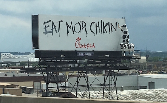
I was the first billboard company to ever install the Chick-Fil-A “cows” ad campaign, the one where the cows write things like “Eat More Chikin” and are three dimensional. In fact, we were hired to install all the rest of them in the D/FW metro, as it was too hard for most billboard companies to figure out. These 3D signs are attention-getting – but are they really that effective? Should you suggest one for your advertiser?
Very expensive to build
These 3D graphics are very expensive. We’re talking tens of thousands of dollars, not just a few. They are built using giant blocks of foam that is sculpted, then covered in fiberglass, and then painted. There are only a few people in the U.S. who build these things, and they are not cheap.
Often hard to make out what’s going on
When we first installed the “cows”, nobody could tell what they were. We had to modify the paint job to accentuate their features. You may think that everybody knows what that giant blob is, but when you put it up in the air and drive by it at 60 mph, it can be a whole lot harder to make out. There’s nothing more depressing than spending a huge amount of money and nobody cares.
Weather exposure
Big 3D blocks of foam and fiberglass have a lot of wind load on them, and don’t fare well in big winds. And if they hit the ground, they virtually explode. That means that you are constantly worrying about your huge capital investment every time you see a weather warning.
Few successes
OK, name all the successful 3D ad campaigns. OK, just try and name two. Chick-Fil-A is the only one most people can think of. When you are talking the capital investment these require, you need greater proof of success. Additionally, there are no 3D designs for McDonald’s and most of the top industry users.
How to get similar success in an easier fashion
Instead of expensive 3D ads, you are often just as successful using simple cut-outs – the portion of the advertisement that reaches out over the top or bottom of the sign face. These are also expensive, but a fraction of the price of 3D options, and withstand winds much better. To be honest, I’m not sure that the average drive could tell the difference between a 3D sign and simple cut-outs of the same size.
Conclusion
3D ad designs are expensive and risky. The better option is to use terrific photography on the vinyl ad, and then compliment that with extensions. Same bang for less buck.
New Billboards For Sale On OutdoorBillboard.com
The Market Report
Prices Are Delayed By At Least 15 Minutes